This post is the Part 2 of the IMDB TV show analysis. Part 1 of the analysis which deals with overrated/underrated TV shows, consistency of TV shows, and whether shows were canceled early or went too far, can be found here. In this post, I primarily work on answering 4 questions - which genres have become more or less popular over time, have there been changes in proportion of new TV shows over time, lead age over time, and if there is gender bias during voting on shows - more specifically if shows targeted towards females are voted higher or lower than males.
Introduction
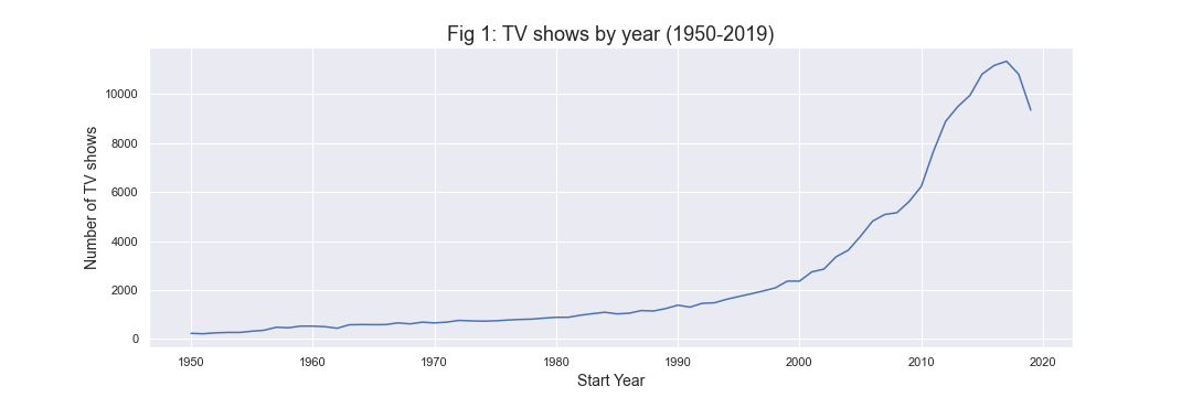
I begin by looking at some exploratory plots for number of shows over time. In Fig 1 below, it can be seen that number of shows over the years have grown until 2017. However, interestingly after 2017, there has been a small decrease in number of shows. Until around 1990, the growth trend can be seen as linear but afterwards the number of shows has been growing at an increasing rate. This is not so surprising given the increased accessibility to television as well as increase in streaming services like Netflix, Amazon Prime, Hulu, etc.
Shows in which genres have increased or decreased over time?
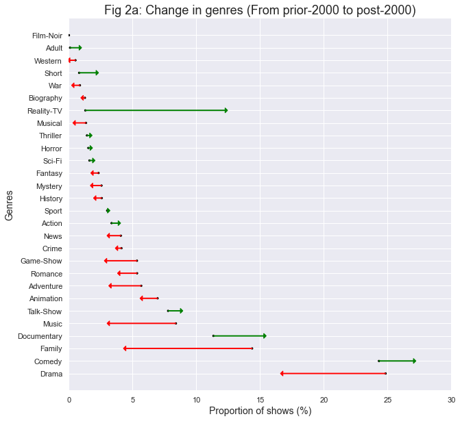
Here, I wanted to look at which genres have changed in popularity - in terms of proportion of total TV shows in that period. In this dataset, each TV show title can have up to 3 genres. In Fig 2a below, the arrow plot shows how genres have changed prior to and post 2000. Reality-TV increased from around 1% of total shows before 2000 to over 12% after 2000. Documentary and Comedy shows increased as well - although Comedy was high to begin with. Family, Drama, and Music genres decreased in proportion.
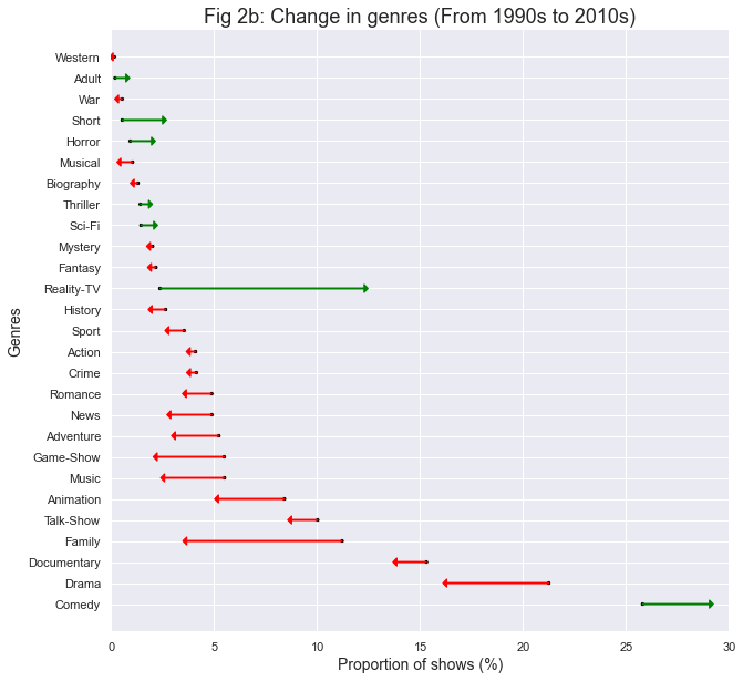
In Fig 2b below, I compare only the largest show decades in prior and post 2000 groups - i.e. decades of 1990 and 2010. We see similar patterns for Reality-TV, Comedy, Family, Drama, and Music as in Fig 2a. However, in this comparison, we can see Documentary also going down. Animation and Game-Show genres also decreased in proportion of total shows.
Has proportion of new shows changed over time?
Next, I look at whether over the time more new shows are coming up or if the older shows (that started in previous years) are dominating in numbers. For this, we can either use TV show data or TV episodes data. TV show data weighs each show equally - and not according to their number of episodes, while TV episodes captures more of what is on television - in terms of time. A new show or new episode is defined as the TV show in its first year or episodes that air in the first year of the show inception. So, for instance, for Breaking Bad, 2008 is the year of inception and hence all episodes appearing in 2008 are new episodes. This also happened to be Season 1 in this case though this is not always guaranteed - the same season can be spread across multiple years and also two seasons can air in the same year. For episodes airing in 2009, Breaking Bad is not counted a new show anymore and its episodes are also not new episodes.
In Fig 3 below, we can see the proportion of new shows and episodes over time. New shows proportion is more stable and for the most part has stayed in the range of 45-55%. New episodes, on the other hand, have varied a great amount.
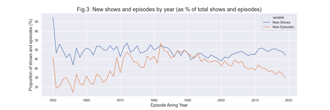
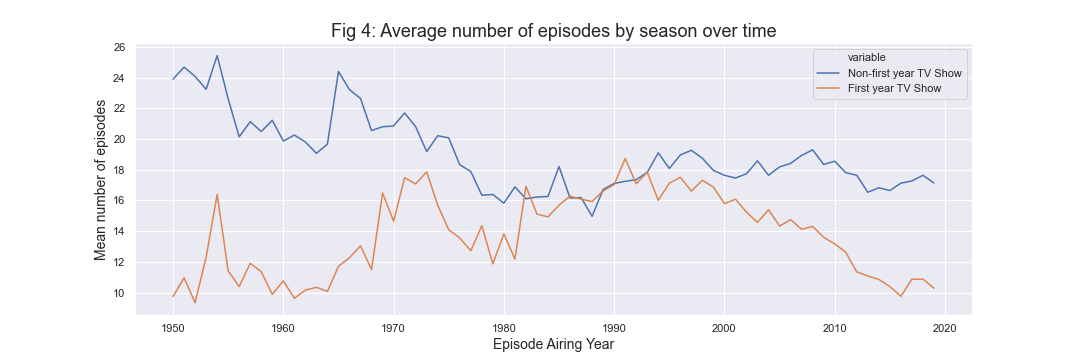
In the period except between early 1980s and early 1990s, new episode proportion is much lower than new shows proportion. This indicates that first year shows tended to have low number of episodes compared to non-first year shows in the period except between early 1980s-1990s. To confirm this, I plot mean episodes by grouping shows in first year and non-first year shows over time in Fig 4. It can be seen through this plot that indeed first year shows have lower mean number of episodes than non-first year shows except in the above said period. Generally, one would expect first year shows to have less average number of episodes, because that is when a lot of the shows would probably be canceled. If a show is not good, a lot of times it would be canceled early - so that should bring down average for first year shows. It can also be due to TV mini-series as they are only 1 season long and also tend to have less number of episodes than TV series.
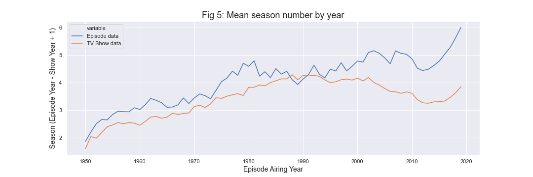
Finally, another way of looking at how old TV shows are at a particular time is to plot mean difference of episode year and show year. This has been used to define a season number as the usual season number can change during a year. Again, this can be visualized using both episodes and TV show data. In Fig 5 below, we can see this plot. An average episode age has been almost on an increasing trend and in 2019, it is in 6th season (or 5 years old). An average TV show on the other hand peaked around 1990, and most recently in 2019, is in 4th season (or 3 years old). Again, the reason for this discrepancy can be explained based on Fig 4 as TV shows in first season tend to have less episodes on average, larger season episodes are overrepresented in episodes data. In a sense, TV show data only counts one episode per TV show per year.
Has the lead age changed over time?
In this section, I look at whether lead actor/actress age has changed over time. We often hear or read about ageism in Hollywood. Previously, it has been looked for movies using IMDB dataset here.
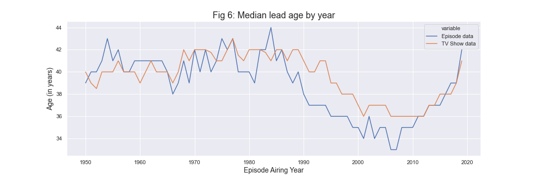
In Fig 6 below, we can see some evidence of ageism in the context median lead’s age from mid 1980s to late 2000s as median age continued to fall. Normally, as a TV show becomes older by one year, the lead’s age will also increase. So, in theory, with no new shows, lead’s age should increase. However, in Fig 3 above, we noticed that there are around 45-50% new shows in any given year. Since late 2000s, we see an increase in median age - though we need to add a caveat of actor reuse as generally same actors are part of multiple shows over the years. So, the trends need to be observed for a longer duration of time.
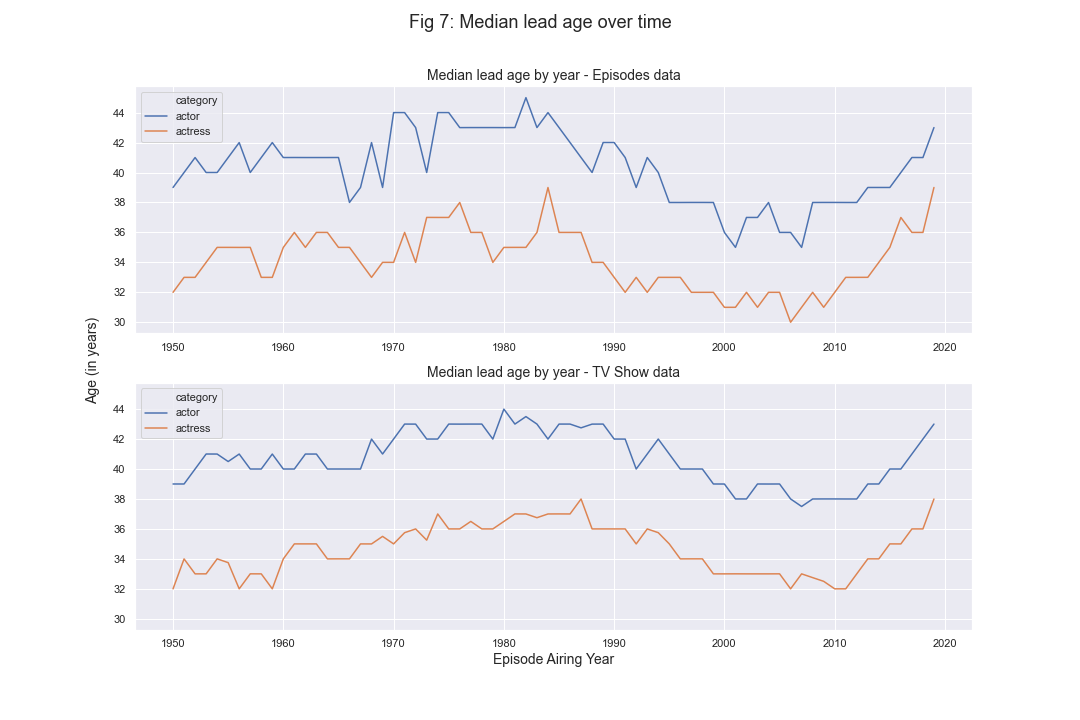
Next, in Fig 7, I compare difference between lead actor and lead actress age over time. There is almost an equal amount of difference of 5-6 years between median lead actor and actress age over the years. In 2010s, the gap seems to be reducing a little.
Is there gender bias in IMDB ratings?
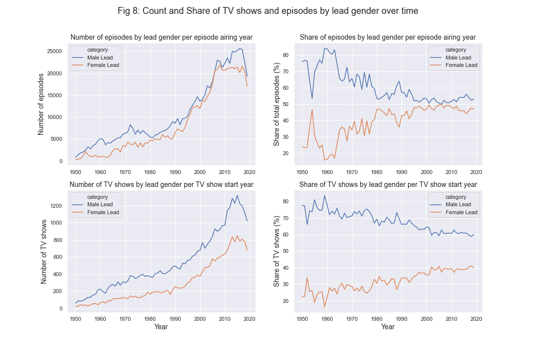
Before, looking at the evidence for gender bias in IMDB ratings, first I look at number of TV shows and episodes and their share by lead’s gender in Fig 8 below. The year axis for TV shows is start year of the show while for episodes it is the airing year of episode. Based on both of these measures, it can be seen that proportion of TV shows with female lead has been increasing over time since the 1960s. It is interesting that based on the episodes data, shows with female leads are almost close to 50% but based on TV show data, it is around 40%. This suggests that either shows with female leads tend to have more episodes or there is discrepancy in leads defined for TV show and in their respective episodes - this can be the case for something like TV shows where each episode has different leads.
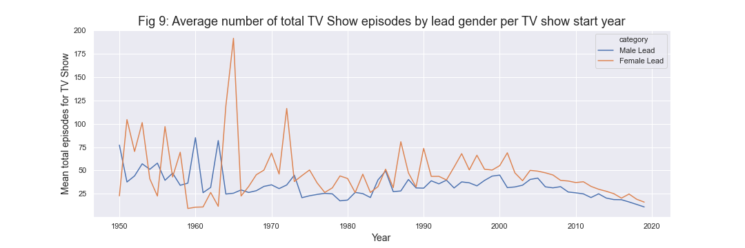
In Fig 9 below, I plot average number of episodes for TV Show grouped by lead gender over time (TV show start year). We can see that indeed shows with female leads tend to have higher number of episodes.
Finally, I look at whether there is evidence for gender bias in IMDB ratings. Previously, it has been discussed that men sabotage ratings for shows aimed at women and TV shows targeted towards female audience tended to have lower ratings on IMDB. Here, I control for host of other variables - like genres, number of seasons, number of episodes, number of votes, TV show start year; and look for evidence of this bias.
To figure out shows targeted towards females or males, I created a proxy variable for female oriented shows and male oriented shows by looking at the ordering of actors. IMDB dataset provides this information. A female oriented show was classified as any show with lead actor as female and either both actors among top 2 actors to be female or most of top 4 actors (i.e. >= 3) to be female. Similarly, a male oriented show was classified with applying the same rule but with male actors. TV shows that did not fit in either of these classifications were classified as gender neutral. This rule was experimented with to replicate finding sets of female oriented shows identified here. Although this rule is not perfect, it allows to remove lot of false positives (shows incorrectly classified as female shows just based on lead actor being female).
I ran a linear regression model on ratings, controlling for a bunch of variables in addition to whether the show was gender neutral, female, or male oriented. Restricting to TV shows with at least 1,000 votes, shows targeted towards females are rated 0.19 points lower than male shows and neutral shows are 0.11 points lower. Looking at TV shows with at least 5,000 votes, female shows are rated 0.26 points lower while neutral shows are 0.16 points lower. Finally, for shows with at least 20,000 votes, female shows are rated 0.34 points lower and neutral shows are 0.17 points lower. All of these effects are statistically significant (confidence interval - 99%).
Fig 10 below is an interactive box plot (with points denoting TV shows) grouped by the gender classification discussed for shows above. This graph only includes shows with at least 5,000 votes and median episode rating greater than 250. It can be seen that male shows on average are rated higher than neutral and female shows - confirming some of the gender bias in rating for female oriented shows.
Note: For this interactive plot, hover over the points to see additional information (or tap if on mobile). Box selection allows zooming in, and double clicking resets the zoom to default.
This concludes part 2 of the IMDB TV Show Analysis. The code used for this analysis (and part 1) can be found here. Part 1 of the analysis which deals with overrated/underrated TV shows, consistency of TV shows, and whether shows were canceled early or went too far, can be found here.
To see this post on medium, click here.