In this post, I present the results of analysis of TV shows using IMDB data. IMDB is a large online database of information about movies, TV shows, video games among other content. For this analysis, I have focused on ratings for TV Series, TV miniseries, and episodes. The data was downloaded on . Complete dataset documentation can be found here. In the rest of the post, I discuss primarily 3 questions - are certain TV shows overrated or underrated, which TV shows are among the most or least consistent, and which TV series canceled too early and which ones went on far too long.
Part 2 of the analysis which includes analysis of various variables over time - like genres, new series, and tests for evidence for ageism and rating discrimination over gender (shows with lead actor v/s lead actress), can be found here.
Introduction
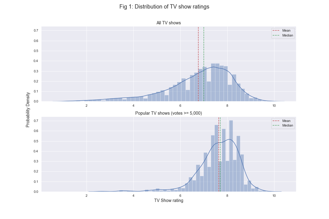
I begin by looking at some exploratory plots for distribution of ratings. In Fig 1 below, it can be seen through the histogram of ratings that they are somewhat negatively skewed but most of them are between 6 and 9. Among the popular TV shows (with at least 5,000 votes), the distribution is much more concentrated in 6-9 range.
Are certain TV shows overrated / underrated?
First, I wanted to compare differences between show ratings and their episodes. Instead of looking at show ratings, we can also look at the median rating of their episodes. In theory, both of these ratings should be close to each other. So, in Fig 2 below, I created an interactive plot of TV show rating against median episode rating for shows with at least 5,000 votes and with median episode votes of at least 250. This allows us to create a definition of underrated and overrated shows - the shows for which majority of the episodes are rated below the show rating is overrated and similarly, if majority of episodes are higher than show rating, it is underrated. In Fig 2, overrated shows are above the green equivalence line and underrated series are below. I define a simple measure of deviation between show rating and median episode rating (Relative rating deviation).
Higher and positive values of imply more overratedness and lower and negative values imply underratedness. According to this measure, we can see some of the heavily underrated shows - Batwoman , Roswell, New Mexico , and Shadowhunters . Similarly, among the most overrated shows are The Simpsons , Masters of Horror , and Twilight Zone .
Note: For all interactive plots, hover over the points to see additional information (or tap if on mobile). Box selection allows zooming in, and double clicking resets the zoom to default.
From Fig 2, it also appears that TV shows prior to 2000 had higher . In Fig 3a below, I look at variation in by season and year groups. It can be seen that shows that started prior to 2000 tend to have higher positive deviation than more recent series while there is no significant deviation difference across number of seasons. Higher proportion of shows prior to 2000 are in the overrated category and higher proportion of shows post 2015 are in underrated category, while 2000-2014 group seems to be symmetrical around .
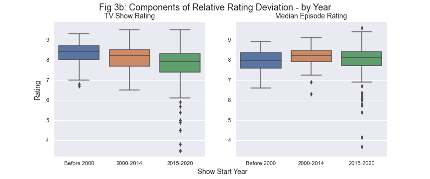
It is interesting that older shows tend to show higher values of . It is not clear as to why this might be the case but to look more closely, I plot the two components of separately in Fig 3b. Also, since there is no apparent deviation across number of seasons in Fig 3a above, I have focused on deviation by show start year. We can see that both TV show rating and median episode rating are slightly higher in 2000-2014 v/s post 2015 group. However, prior to 2000 shows have both highest TV show rating and lowest median episode rating as compared to other year groups. Also, median episode rating appear more stable than TV show rating (less variation overall) across the years. Perhaps one reason for higher show rating for older shows could be a nostalgic - would one tend to remember previously watched shows more positively? IMDB came into existence in 1993 and internet became more widespread in 1990s so some of the voters for older series may not have rewatched it closer to when they voted for it. Episode voting on the other hand will not suffer from this as one would not generally remember individual episodes as they would remember a TV show. However, this is just speculative and based on the data available, it is not a testable hypothesis.
I also look at variation in by genre. Each title in IMDB dataset can be associated with maximum of 3 genres. In Fig 4a below, we can see that Animation and Documentary shows tend to have higher compared to other genres and thus are more overrated. Note that since each TV show can have 3 genres, the outlier TV shows can be represented by a maximum of 3 points on this plot.
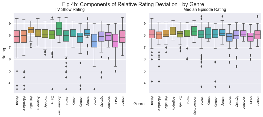
Again, it is unclear as to why these two particular genres tend to have more overrated shows. So, I wanted to look at the components of by genre. In Fig 4b, it can be seen that median episode ratings are fairly similar across genres but TV show rating is higher for Animation and Documentary. Thus, their overratedness is explained more by higher TV show rating instead of lower median episode rating.
Finally, I created an interactive plot to visualize by genre and TV show start year. This plot has jitter applied to it. We can hover over the points to see information about TV shows. Similar to Fig 4a above, TV shows can be represented by a maximum of 3 points on this plot.
Which shows are among the most / least consistent?
Next, I look at rating consistency in TV episodes. For a measure of rating consistency, I defined a simple metric of Relative standard deviation.
Higher values of imply less consistency. Looking at Fig 6 below, it can be seen that shows with more episodes tend to have higher . Excluding miniseries, among the least consistent shows are Are You Afraid of the Dark? , House of Cards , and Chicago Med . The most consistent TV series are shorter series like Cosmos and Gypsy . Among series with at least 100 episodes, Rules of Engagement and 2 Broke Girls are the most consistent. The green line has the slope of regression ( v/s logarithm of total episodes) while the white line ignores genres which tend to have less episodes like Biography, Documentary, and History. We can see that positive relationship exists even in absence of those genres. It is not entirely surprising that longer series will have more chances to have outlier episodes (either positive or negative) which tend to reduce the show consistency.
In Fig 7a below, we can see change in according to rating and year groups. Years of 2000-2014 appear pretty similar to 2015-2020. In the pre-2000 group, we see higher rating shows to be relatively more consistent. Comparing across year groups, lower/mid rating shows are less consistent pre-2000 v/s post-2000.
The pattern in pre-2000 group looks different than other groups. So, I wanted to check if the difference in number of episodes can account for some of this discrepancy. In Fig 7b below, we can see that these groups with higher in Fig 7a tend to have higher value of total episodes too.
Comparing across genres, we do not see very significant changes, but Animation does have higher median than other genres and Biography, Documentary, and History tend to be more consistent.
One of the reasons for some genres to be more consistent could be that these series are usually shorter than others. Hence, I looked at consistency of TV shows by genres and number of episodes. Fig 8b is an interactive plot where size of the circle is proportional to total episodes. We can see that Biography, Documentary, and History tend to also have less number of episodes.
Did the series cancel early or went on far too long?
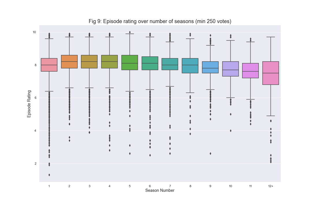
For this section, I filter the titles by TV Series and exclude miniseries as those are only 1 season long. To look at which series cancel early v/s those that went too far, I first plot episode rating by season number for episodes with at least 250 votes. In Fig 9 below, we can see that median rating is highest around 2-4 seasons and starts falling after that. After season 8, there is gradual bigger drop. Based on this, generally anywhere between seasons 2 and 4 is the ideal length of a TV series. This plot is very similar to one obtained here based on data from 2013.
Instead of defining a common peak for all series, we can also look at their peaks separately. In Fig 10 below, I have created an interactive plot between final season median rating against median rating among all seasons prior to the peak season. Peak for a series is defined as the season with highest median rating. By definition, thus all series with 1 season will lie on the straight green line which signifies equivalence of final season rating and prior peak rating. The size of the circle on the graph is proportional to absolute difference between prior and post peak rating. So, the series that went on for far too long can be either ones with very big circles or very far below the equivalence line. Some of these series from former category are Are You Afraid of the Dark?, Lethal Weapon and Misfits. The ones from latter category are Two and Half Men, Scrubs and Game of Thrones. House of Cards falls in both these categories. The final season of Game of Thrones was eagerly awaited but ultimately disappointing. House of Cards’ bad ratings in the final season may have had something to do with Kevin Spacey’s character being removed in the final season - due to sexual misconduct allegations against him. For Scrubs, the final season got rid of most of the full time cast from previous seasons and was more suited to be a separate spin-off series. Regarding series that ended too soon - we can count them as series with 1-2 seasons either falling on the line or above it in the greater than 8.5 range before peak. Some of these series are Cosmos: A Spacetime Odyssey, Fawlty Towers, Cosmos (1980), and Firefly. Freaks and Geeks is also one of the series whose name comes up usually in such a discussion.
Note: This plot only includes TV Series with prior peak rating of at least 7
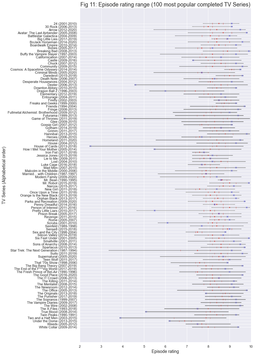
Finally, I look at the range of ratings for 100 most popular completed series. Similar plot has been created in the past here with data last updated in 2017. This also allows us to see consistency (as used here) among series as well as to compare various series and how well did they end. The red points indicate the median and 1st and 3rd quartiles while blue cross is the finale rating. Most of the series had good finales and finished strong but some were very bad. Some of the series with high difference between median episode and finale rating (finales worse than median episode rating) are Dexter, Game of Thrones, House of Cards, True Blood, and Two and Half Men.
Breaking Bad is one of the few series with all episodes rated above 7.5 and only series with an episode rated 10! Game of Thrones is actually pretty good overall (very small difference between max value and 1st quartile), but had some very poorly rated episodes in its last season. Some of the series with all episodes above 8 are Big Little Lies, Cosmos: A Spacetime Odyssey, Firefly, Freaks and Geeks, Mr. Bean, Person of Interest, Rome. In this set of most popular shows, Under the Dome is only series with no episode rated higher than 8.
This concludes part 1 of the IMDB TV Show Analysis. The code used for this analysis (and part 2) can be found here. Part 2 of the analysis can be found here which includes analysis of various variables over time - like genres, new series, and tests for evidence for ageism and rating discrimination over gender (shows with lead actor v/s lead actress).
To see this post on medium, click here.
Comments
Nice!
Thanks man! :)
Thanks! :)
Great work!
Thanks! :)
Looking forward to Part 2!
Coming soon! :)